BUILDING A BRAND AS GOOD AS THE BUSINESS.
REBRANDING A LOCAL FAVORITE
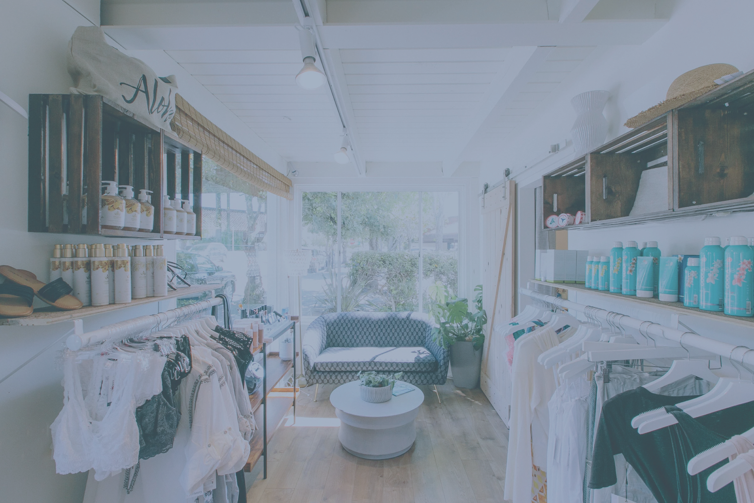
HoneyGirl Beauty has been a Mill Valley fixture for nearly a decade. It’s a boutique waxing studio and clothing shop with a loyal following built almost entirely on word of mouth. HoneyGirl had something most brands spend years trying to manufacture: a genuine personality, real client relationships, and a space that felt nothing like a salon. What it didn't have was a brand that communicated any of that to someone who'd never walked through the door. Prospect Co. was brought in to change that, leading a full brand refresh from competitive research through visual identity, messaging, and a rebuilt website.
Competitive analysis
Messaging architecture
Brand narrative
Website copywriting
Logo design
Color & typography
Brand guidelines
Website design, UX, & implementation
RESEARCH & DISCOVERY
FINDING THE WHITE SPACE IN A CROWDED MARKET
A competitive audit of waxing studios and beauty boutiques in southern Marin revealed a predictable landscape — brands that were either clinical and premium, aggressively cheerful, or simply generic. None of them were owning what HoneyGirl already had in abundance: warmth, genuine connection, and the kind of easy, personal energy that keeps clients coming back for years. That gap became the strategic foundation for everything that followed.
BRAND STRATEGY & POSITIONING
OUT-PERSONALITY THE COMPETITION
HoneyGirl's opportunity was to own the territory no competitor was claiming — a waxing studio where the service is expert, the vibe is easy, and the relationships are real. The resulting positioning, waxing you'll actually look forward to, does something no competitor in the market is doing: it acknowledges the inherent awkwardness of the service with a wink, then immediately reframes it. A messaging architecture built around these pillars gave HoneyGirl a distinct voice and point of view.
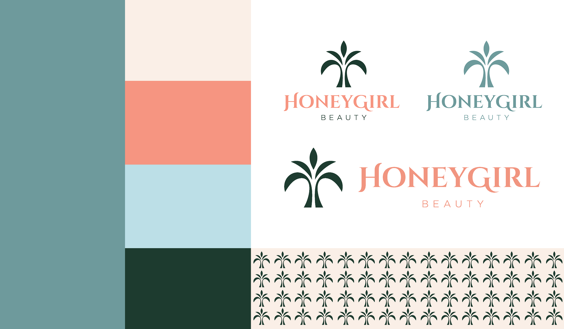
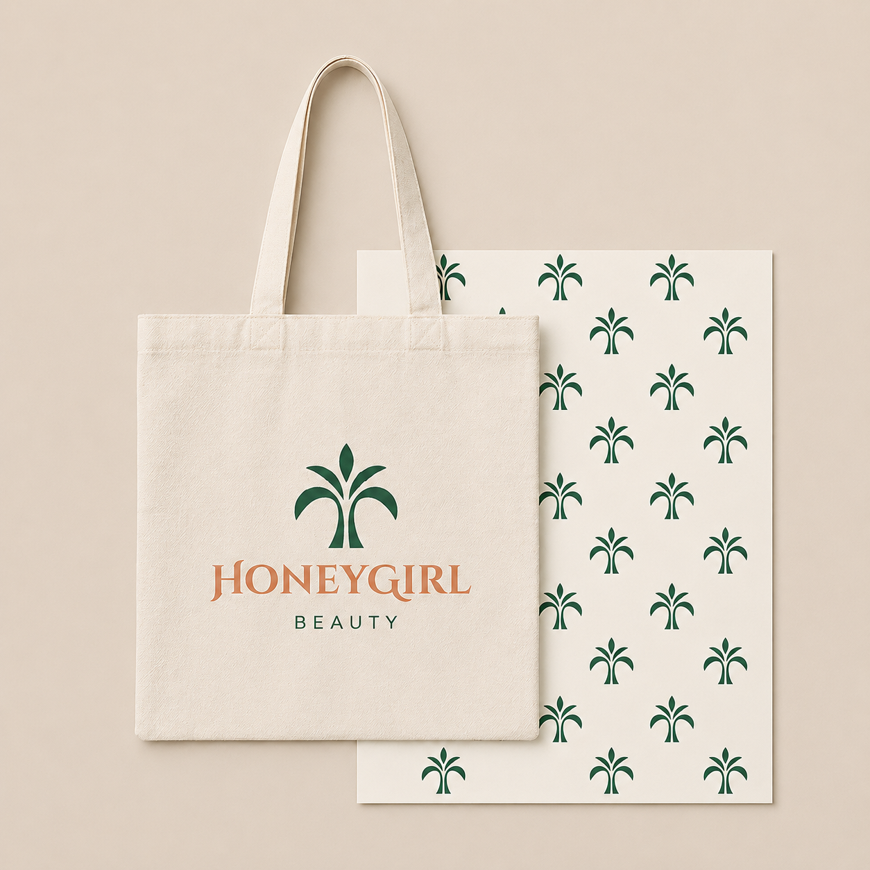
BRAND IDENTITY
A BRAND AS WARM AND DISTINCTIVE AS THE BUSINESS ITSELF
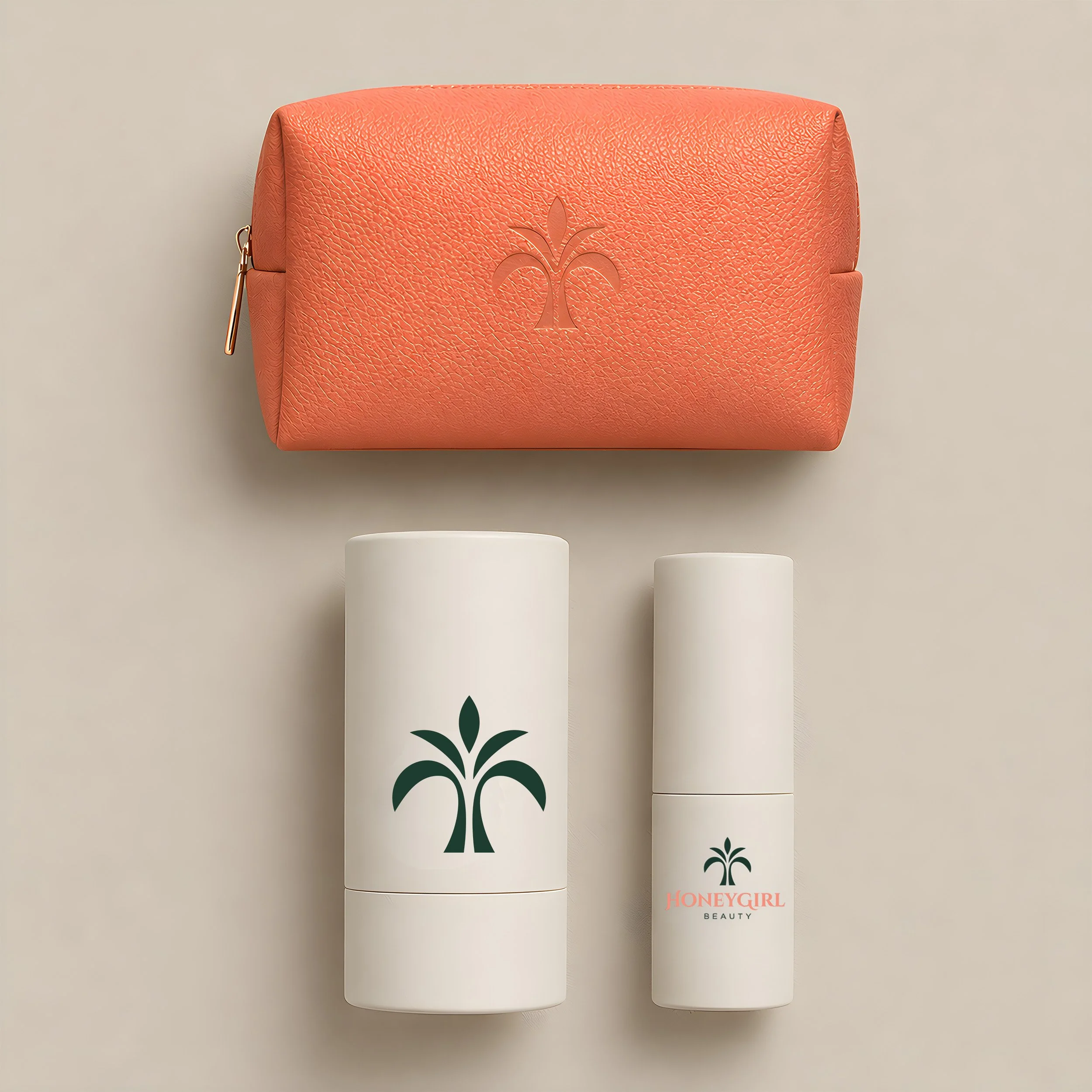
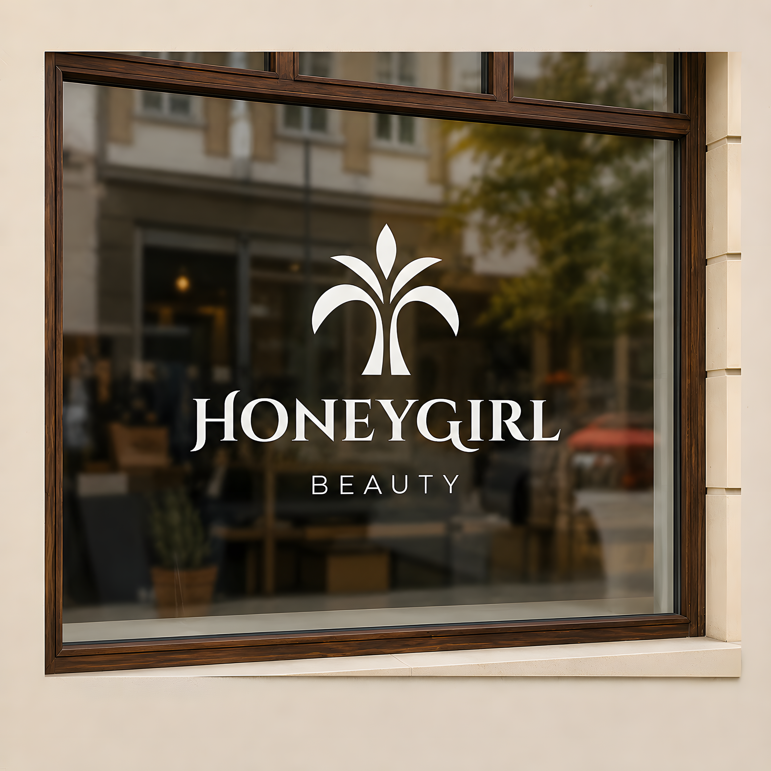
Visual identity development began with the same competitive lens. The beauty category defaults to blush pink, soft scripts, and spa-adjacent aesthetics that feel interchangeable. The goal was to build something that could only be HoneyGirl. I developed the creative direction and color strategy, art directed an external logo designer through multiple rounds of concepting and refinement, and designed supporting brand elements myself. The resulting identity — warm, aloha-inspired, and grounded in a palette the founder literally lives with — gives HoneyGirl real visual authority for the first time. A comprehensive set of brand guidelines covering logo, color, typography, photography, and voice ensures the brand can be applied consistently across every touchpoint.
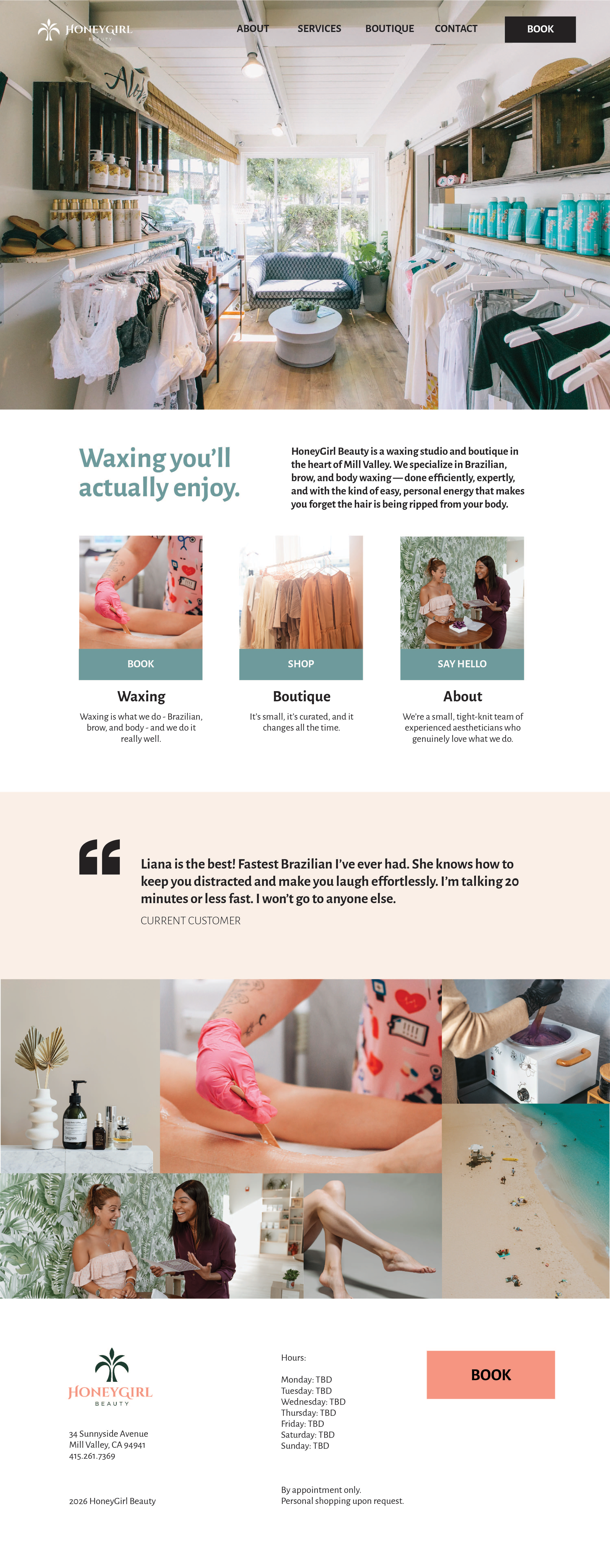
WEBSITE DESIGN
A DIGITAL PRESENCE THAT IS UNMISTAKABLY HONEYGIRL
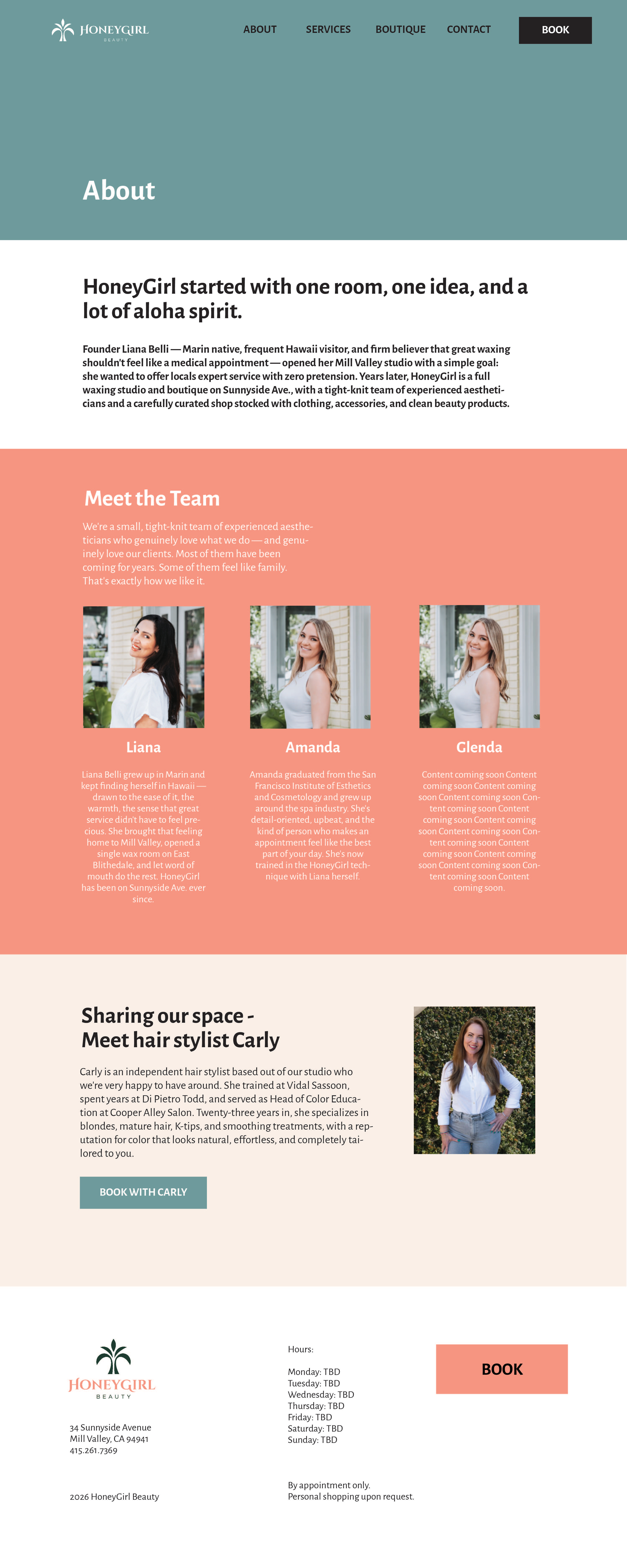
The original website led with policy instead of personality, buried the boutique, and made booking harder than it needed to be. The redesign addressed all of it — starting with content strategy and information architecture, then wireframing every page before building in Squarespace. Navigation was simplified around how clients actually use the site. The homepage was restructured to lead with what HoneyGirl is, why it's worth booking, and how to do it. Copy was written throughout in the new brand voice. The result is a site that works as hard as the business does — warm, clear, and impossible to confuse with anyone else.